
Today we will be making use of the Drawer, Tab and Stack navigators. We will cover two cases:
- a simpler scenario where we utilize the Tab Navigator in a single Drawer route
- a more complicated flow where we want the Tab bar to be visible and accessible inside all our Drawer routes.
In this second example, we will try to overcome a design restriction of React Navigation - the different Navigators, if used together, can only be nested inside one another, and therefore can’t be intertwined.
Introduction
Adding navigation to a React Native application is greatly helped by using React Navigation library. It provides different types of navigators, with plenty of customization power. In some simple cases we can get by with using just one navigator, but often times we are presented with a challenge to combine multiple types in an app.
The example chosen is to build an app for a Hotel chain. Some of the features include booking a room at one of the hotels, browsing the different locations and using reward points. Here is a preview of what we will be building:

We can see right away the use of Drawer and Tab navigators. We will also implement each of the routes as a Stack Navigator, since we now that, for instance, the Book flow will contain multiple screens.
Getting started
(if this is your first React Native project, please read the official getting started guide before continuing)
Let’s initialize a new project. In your terminal, navigate to an empty directory and run the following command:
$ npx react-native init NavigationDemo --version 0.64.2
The react version installed at the time of writing was 17.0.2, while the react-native version was 0.64.2.
Next, let’s install react navigation and its dependencies:
$ npm install @react-navigation/native react-native-screens react-native-safe-area-context react-native-gesture-handler react-native-reanimated @react-navigation/stack @react-navigation/drawer @react-navigation/bottom-tabsIf you’re developing for IOS, you also need to install the pods:
$ cd ios; npx pod install; cd ..
Replace the contents of your App.js file with the following code:
Stack and Drawer navigators
Now we can go about adding the different navigators to our app. Remember, for this first example we want the DrawerNavigator to be the main (always visible) navigator in our app, with the BottomTabNavigator visible if the Home route is focused in the Drawer. Let’s begin by adding the following file structure in our project (all the files remain empty for now):

You can download the hotel_logo from the github repo provided at the end of this tutorial, or use your own. Next, we will create our Drawer Navigator that contains three routes (our Stack Navigators). For now, the stacks will contain a single screen defined directly in the stack file. In a real app, the stack can contain many screens, but it’s important to have at least one. Following are the contents of the stack files:
HomeStackNavigator.js:
MyRewardsStackNavigator.js:
LocationsStackNavigator.js:
We will explain the screenOptions in a moment. Now that we have defined our drawer stack navigators, we can create the DrawerNavigator:
DrawerNavigator.js:
And add it to our NavigationContainer in App.js
Let's run our code to see the results so far. Run
$ npx react-native start
to start the Metro bundler. Then, in a separate terminal, run
$ npx react-native run-android
or
$ npx react-native run-ios
depending on which platform you're developing for (run both one after the other if you want to simultaneously work on both platforms).
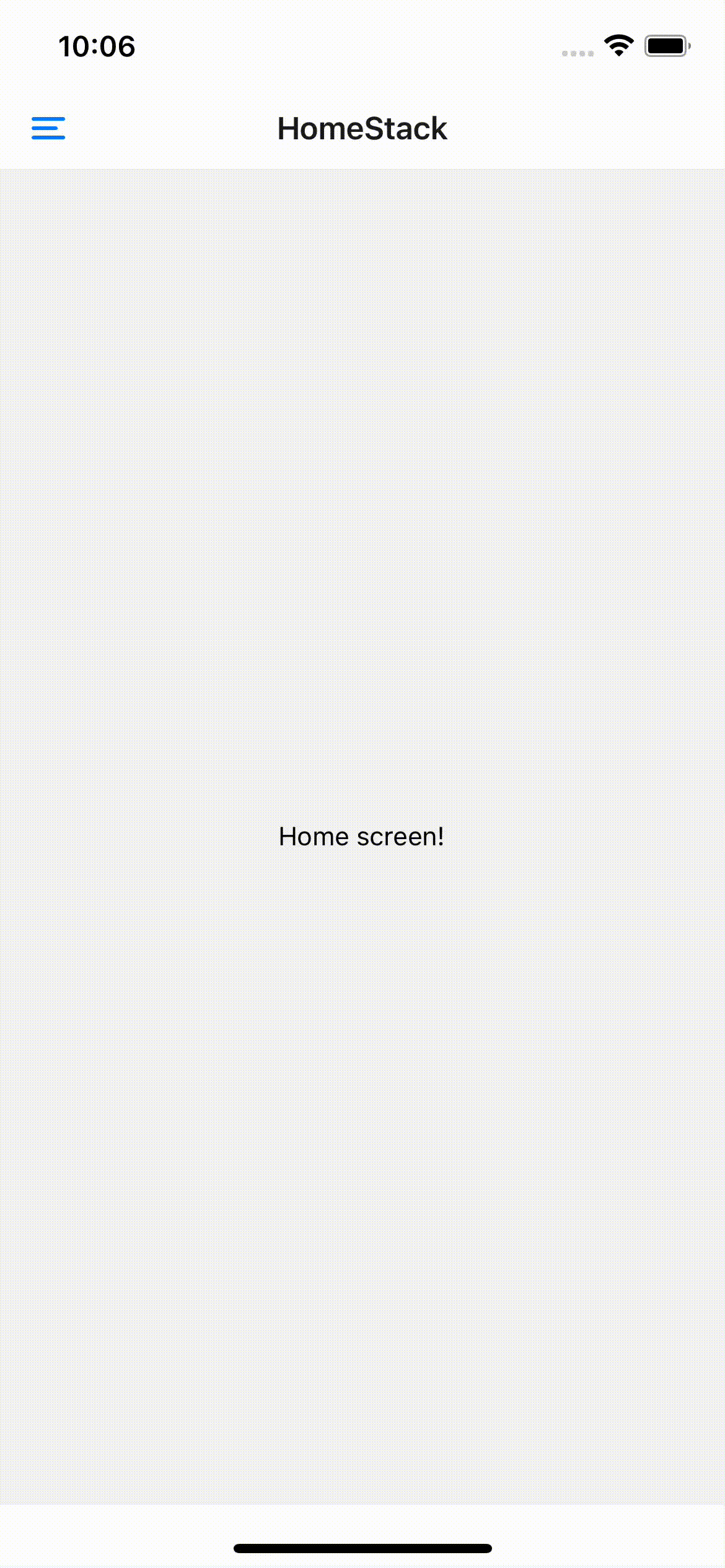
We can see the result now. We have React Navigation’s default header, an icon to open the drawer, and our stacks in the drawer menu. We can navigate freely between those stacks.
Now let’s circle back to the screenOptions we defined in the stack navigators. Try setting headerShown: true in HomeStackNavigator and observe what happens:
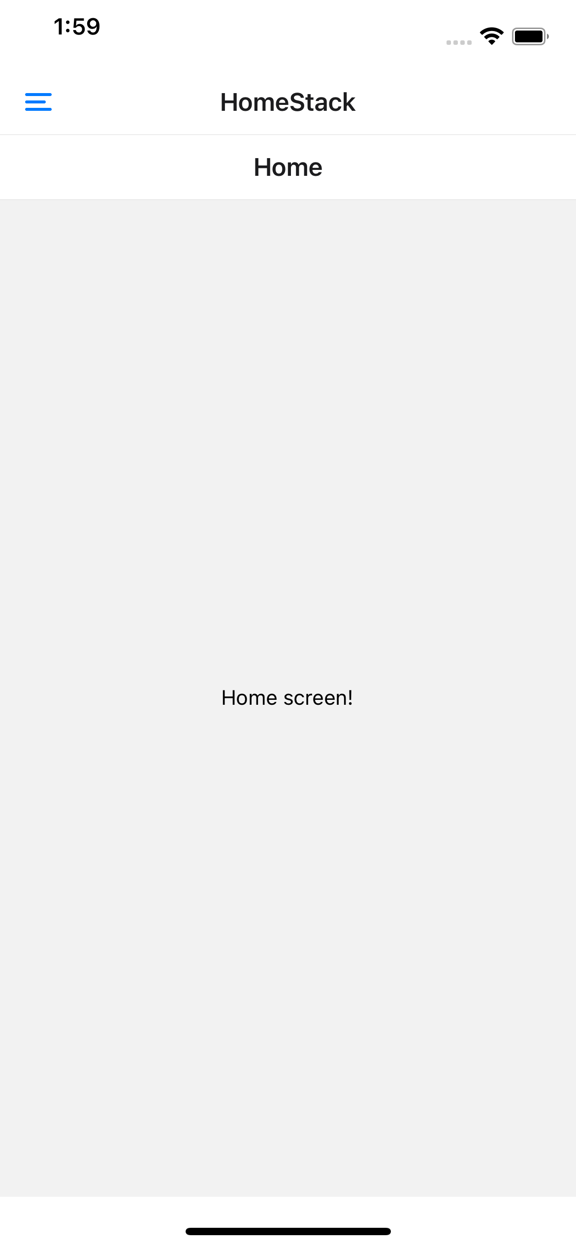
The Home component’s header is rendered below the Drawer Navigator’s. This is because the parent navigator’s UI is rendered on top of child navigator. Since we obviously want only one header, specifying headerShown: false for each of the stack navigator’s screenOptions hides the default stack header. Note that the title displayed in the drawer header is HomeStack, not Home. If we were to navigate to another screen in HomeStack, the title would not change. Could we have kept the Stack header and hidden the Drawer header? Yes! But for now, we want the default Drawer header as it provides us with an easy way to open the drawer - by pressing the menu icon in the header.
Tab navigator
We have added Drawer navigation to our app, and defined stack navigators with screens to add to our drawer menu. Now we need to add tab navigation to our Home Route. Firstly, lets define Book and Contact stack navigators in the same way as before:
BookStackNavigator.js:
ContactStackNavigator.js:
Now let’s create our Tab Navigator.
BottomTabNavigator
Notice how the first tab screen we added is the HomeStack, which we have already added in DrawerNavigator. In fact, you can think of BottomTabNavigator as a container of stacks, with the initial stack being HomeStack. Since in HomeStack we have a Home screen, the initial screen being rendered in the Tab navigator is the Home screen. And because we want to show this when the user is on the Home route in the drawer navigation, we will simply replace the HomeStackNavigator component in DrawerNavigator with BottomTabNavigator:
DrawerNavigator.js:
Let’s look at what we get:
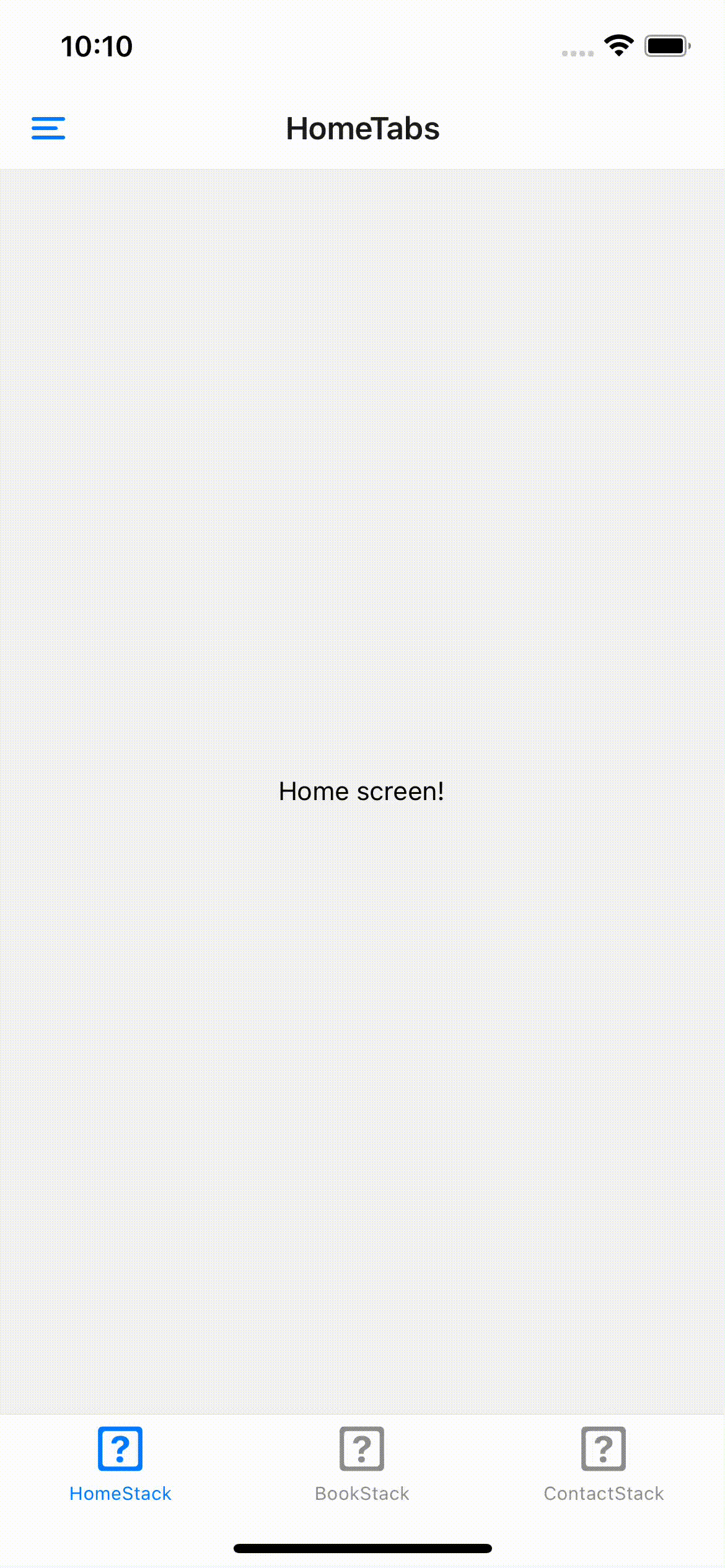
When we are in the first route in DrawerNavigator, we can see the bottom tabs and navigate between them. If we move to another route in the Drawer, the tabs are no longer visible (since the tab navigator is just one of the drawer screens). We have again used headerShown: false to avoid rendering a double header.
Header and Tab design
We have implemented all our stacks, now we want to implement a few common requirements. Firstly, let’s add icons to our tabs. For this project we will use the react-native-vector-icons package to access FontAwesome icons. The full installation guide can be found
here
. Once the installation process is complete, we can edit our BottomTabNavigator.js as follows:

For each stack we have specified an icon and a tab label. tabBarIcon receives the focused prop, which we can use to highlight the current route (tabBarLabel can also receive this prop). There are many possibilities with options and screenOptions properties, some of which are explored at https://reactnavigation.org/docs/screen-options/. Let’s use screenOptions in Drawer Navigator to change the header and route names in the drawer menu:
DrawerNavigator.js:
Let’s breakdown all of the changes. First of all, looking at the Drawer Screens, we can change the header of each drawer item separately. You might not want to display a title when the user is in the Tab navigator, but maybe show the company’s logo instead. The headerTitle prop accepts a string as well as a function - giving us a lot of possibilities for customisation. Furthermore, the title shown in the header can be different than the one shown in the drawer menu.
Next, we want to change the look of the header to fit better with our client’s brand. We can do this by passing a function to DrawerNavigator’s screenOptions and specifying header style and components. ScreenOptions also receives the route prop. We are passing a function to headerLeft that renders our menu icon, and toggles the drawer - this toggle function is available in the navigation object.
Finally, let’s customise the Drawer menu. We only want to change the route item styles for now, and unfortunately there isn’t a simple DrawerNavigation prop that enables us to do this. Instead, we must pass a custom drawerContent function that enables us to render a completely custom component for each item. We are using the passed props to iterate through these items, but we could also render more routes using <DrawerItem>, or add an image component at the top of <DrawerContentScrollView>, or any number of other options.
Conclusion
In this tutorial, we have combined Drawer, Tab and Stack navigators to create a simple navigation flow. We have then, through screenOptions, supplied customization to get the look and feel we needed. In the next section, we will explore the problem of having both the Drawer and Tab navigations always visible and connected.
Part 2 of this tutorial can be found here
The complete project can be found on github


0 comments